
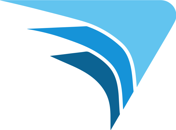
What the mark is
It is a wing. Three tapered forms, stacked and offset the way plan sheets stack on a desk, each one in a different blue: deep navy at the base, the primary Alares blue in the middle, sky blue at the top.
The stacking is the part worth noticing. A wing could have been drawn as a single shape. Drawing it in layers puts a piece of the work itself into the mark, because a set of drawings is exactly what we hand a client at the end of a design.
What it stands for
Lift. Forward motion. Momentum. A wing does not sit still, and it does not get off the ground by accident. It works because someone shaped it correctly.
That reading is deliberate rather than decorative. Alares was founded in 2007 by Don Maggioli, a West Point graduate and former Green Beret officer, and the firm was built on a commitment he set at the start: always achieve our clients' objectives in a swift manner, without sacrificing quality for speed.
Why those two things have to sit together
Speed and quality are usually presented as a trade. Move fast and something slips. Be careful and the schedule slips instead. On the projects we take on, neither version is acceptable, because the buildings cannot stop working while we deliberate and the systems cannot be wrong when we are done.
So the discipline is to be fast in the right places. Investigate before you design, so the design does not need redoing. Decide in the field when the field demands it, rather than deferring and letting the schedule absorb it. Verify what got built, so nobody inherits a problem. Done that way, careful work is the fast work.
Where you will see it
The wing appears on its own as our icon, and beside the wordmark in the full lockup. It is usually blue on white, white on blue, or oversized and cropped off an edge as a quiet watermark behind other content. What it never does is stretch, rotate or change color, because a mark that shifts around stops meaning anything.
The short version
Three layers, one wing. Speed is the promise. Quality is the standard. The mark is there to remind us of both.